Google Play | Brand Redesign
BRAND
BRAND
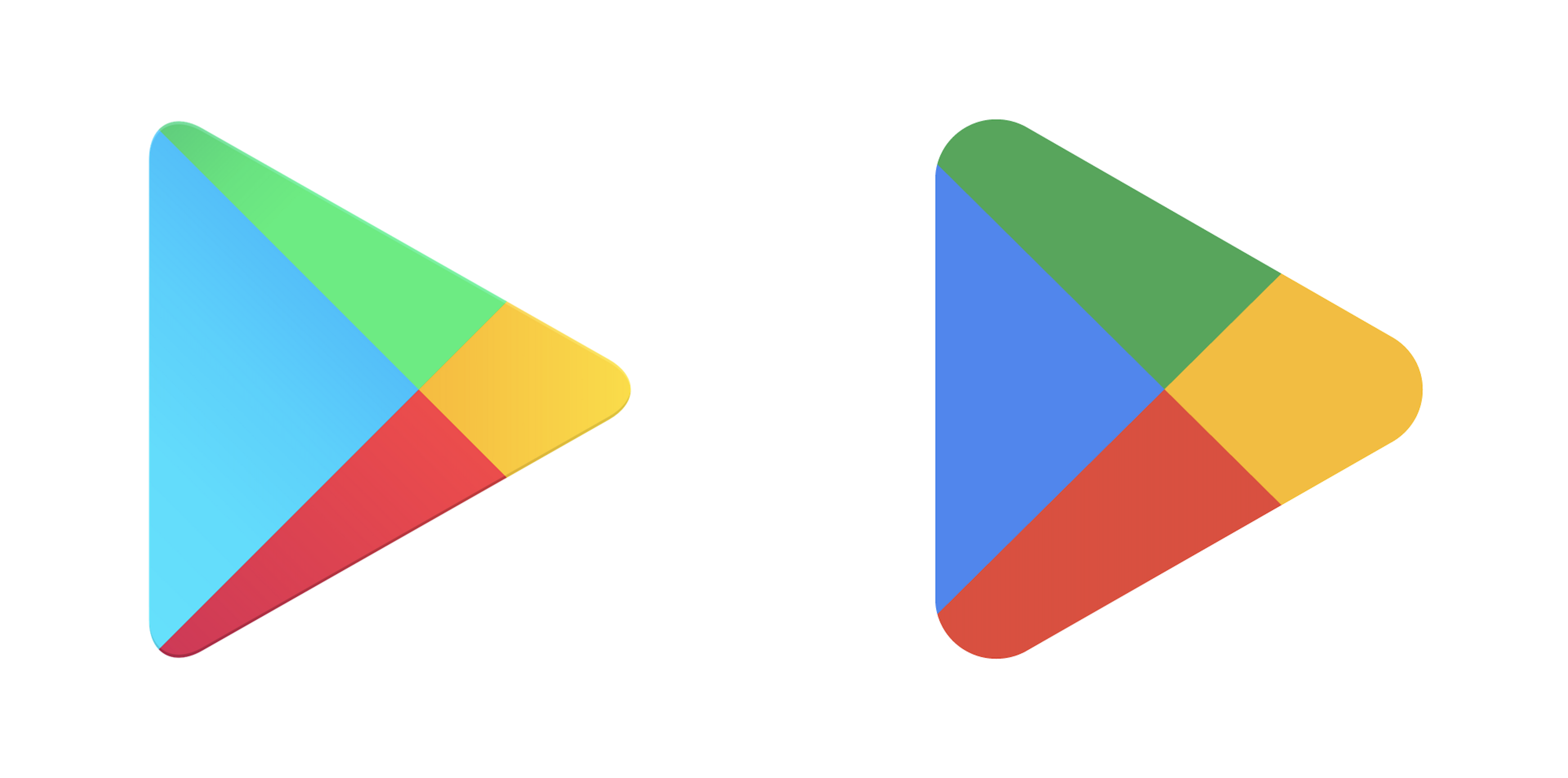
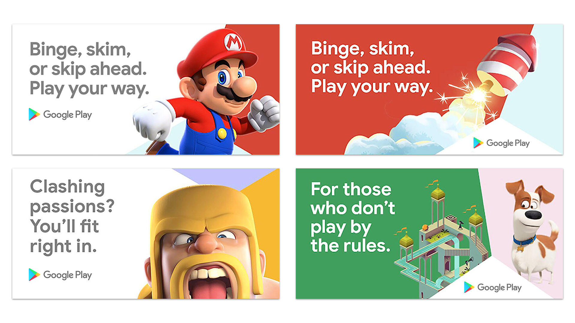
Being one of the largest marketplaces in the world, (over 120 billion downloads a year) the brand had become a tad transactional. As a result, it wasn't living up to the spirit of its name and was missing the opportunity to encourage new behaviors, particularly the act of discovering something new.
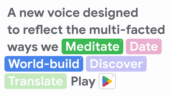
To round out a decade of Google Play, we partnered with Google on a new brand identity system. We saw untapped potential in the legacy of Google Play's logo, commonly referred to as "the Prism." Honing in on the idea that prisms are active and multidimensional—just like discovery, the redesign shifts the prism from a static logo into a prismatic behavior—always seeking to reveal new sides of what you love and expand your world.
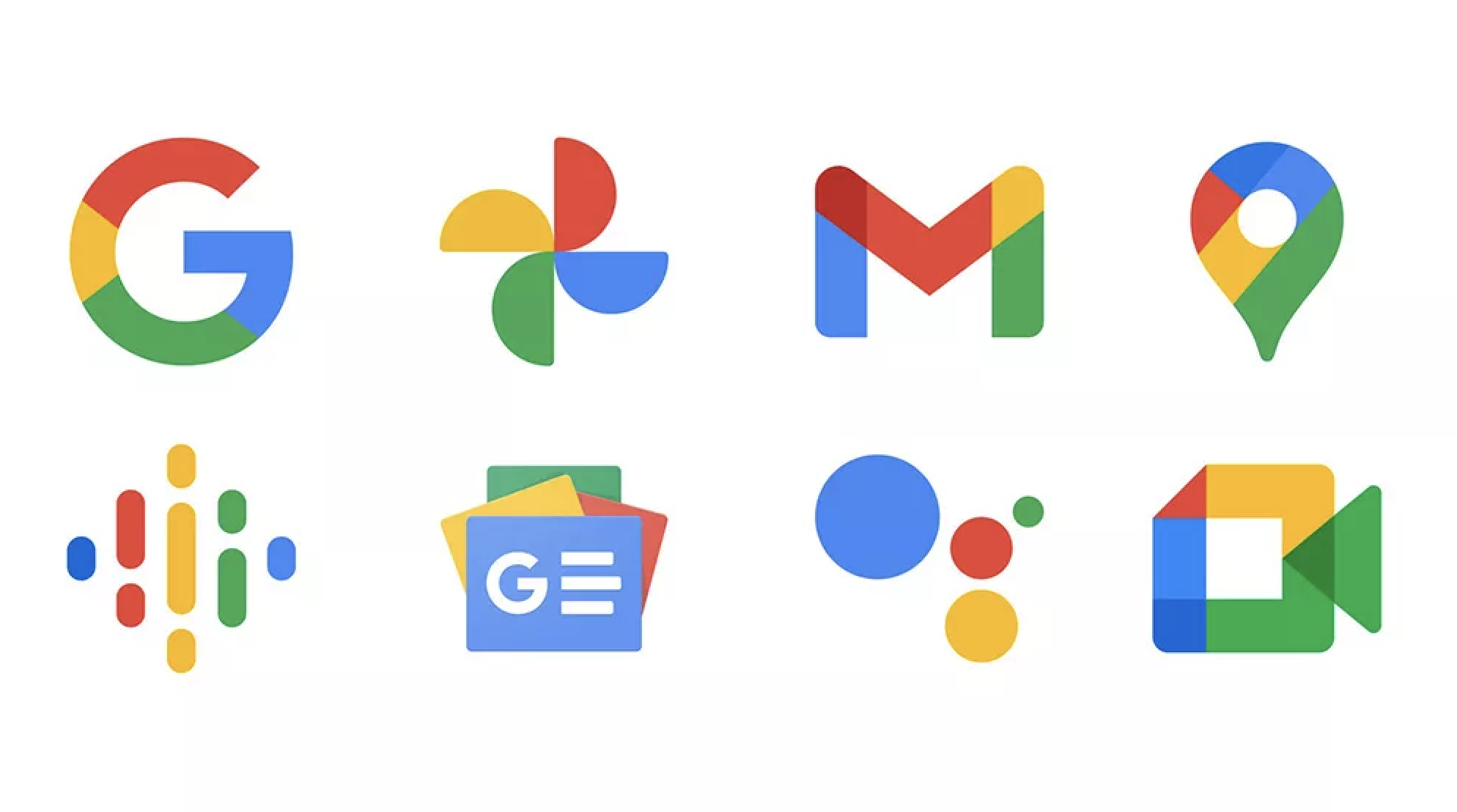
The logo also better reflects the magic of Google and matches the branding shared by many of our helpful products — Search, Assistant, Photos, Gmail and more.
![]()
![]()
![]()
![]()
![]()
![]()
![]()
![]()
![]()
![]()
![]()
![]()
To round out a decade of Google Play, we partnered with Google on a new brand identity system. We saw untapped potential in the legacy of Google Play's logo, commonly referred to as "the Prism." Honing in on the idea that prisms are active and multidimensional—just like discovery, the redesign shifts the prism from a static logo into a prismatic behavior—always seeking to reveal new sides of what you love and expand your world.
The logo also better reflects the magic of Google and matches the branding shared by many of our helpful products — Search, Assistant, Photos, Gmail and more.


MVD 2026 (C)
CARGO COLLECTIVE
CARGO COLLECTIVE